
Project: My eBay re-design
My role
All UI/Visuals and prototypes were created by me. This was a very fluid project with changing directions over a 3 month period. I acted as the liaison between 5+ different groups that all had touch points into My eBay. My focus was to not only evangelize the new concept designs by presenting to other groups but explain the rational on how it would also help their area of focus.
All UI/Visuals and prototypes were created by me. This was a very fluid project with changing directions over a 3 month period. I acted as the liaison between 5+ different groups that all had touch points into My eBay. My focus was to not only evangelize the new concept designs by presenting to other groups but explain the rational on how it would also help their area of focus.
Challenges
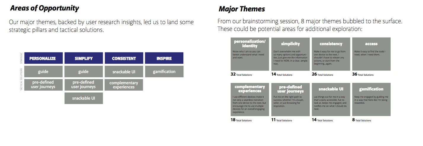
Simplify and clean up all navigation elements by providing clear focal points for major use cases. The navigation was split from a simple side bar approach to a more tabbed siloed framework. The user is driven into the most highly used areas and then sub navigation is clear on the left. The overall design had years of features that were piled on top of each other which made a cluttered UI and areas hard to find.
Simplify and clean up all navigation elements by providing clear focal points for major use cases. The navigation was split from a simple side bar approach to a more tabbed siloed framework. The user is driven into the most highly used areas and then sub navigation is clear on the left. The overall design had years of features that were piled on top of each other which made a cluttered UI and areas hard to find.
Solution
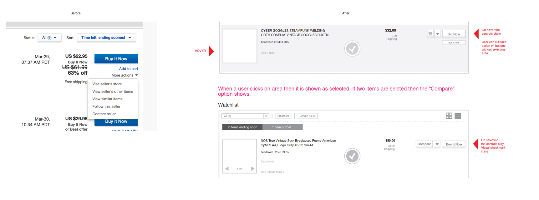
My solution was to expose areas as needed in the proper use cases. Example. Only show compare buttons when comparing items after multiple selections. Expose the most important information a user wants to see in a dashboard approach in all concepts.
My solution was to expose areas as needed in the proper use cases. Example. Only show compare buttons when comparing items after multiple selections. Expose the most important information a user wants to see in a dashboard approach in all concepts.


End-to-end approach
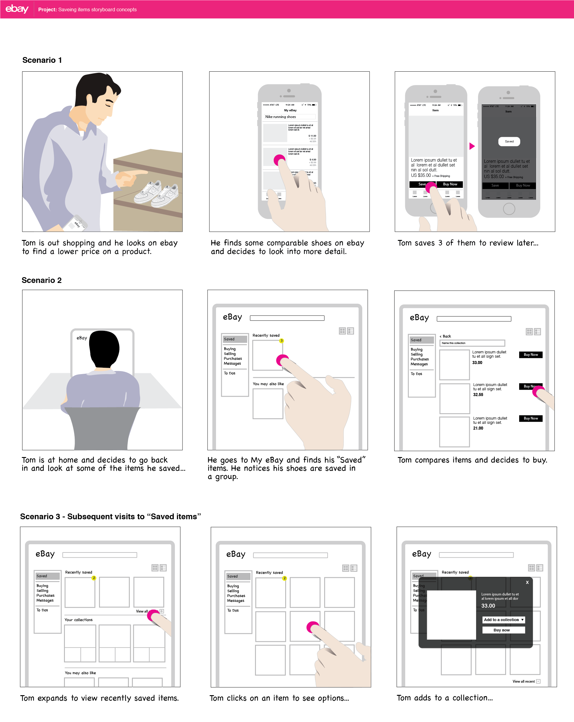
Early storyboarding was created to show how My eBay would work on all devices. Desktop was very important to our seller user base but we learned mobile first was quickly becoming the norm. This storyboard depicts how a user may continue their tasks from mobile to desktop with a seamless experience.
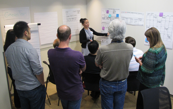
I worked directly with product to do field focus groups and bring users in to discuss various alternatives to My eBay.

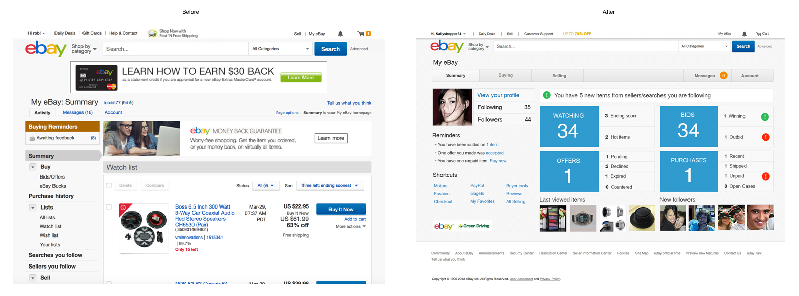
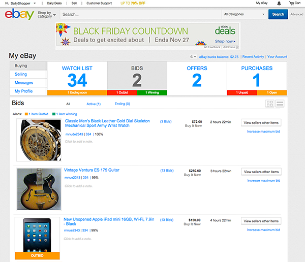
Layout concepts of summary page. Before and after. The new designs main focus was a dashboard approach but still integrating Buying, Selling, Messages and the users Account at a high level tab structure.
Option 2.
💡The second option had various innovations to solve problems that were throughout the product. I kept the concept of an easily visible navigation with a summary style interface that showed what the current status was of the users account. They could see how many items they were watching, buying and selling at a glance.
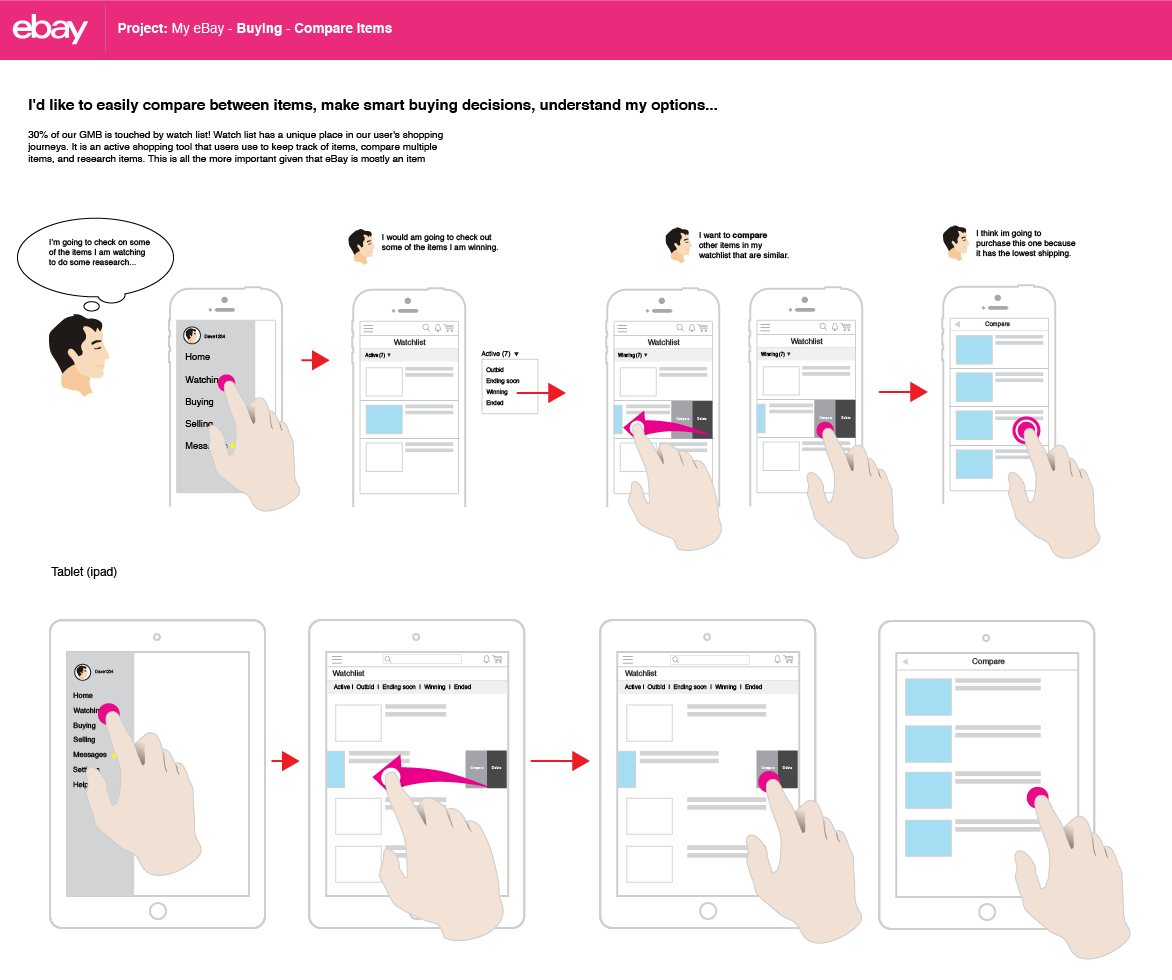
I solved areas that haven't been touch in over 10 years. The eBay compare items was an area that completely lacked UI attention. I created a fundamental selection metaphor that exposed buttons as needed instead of keeping various drop downs and list views of actions.
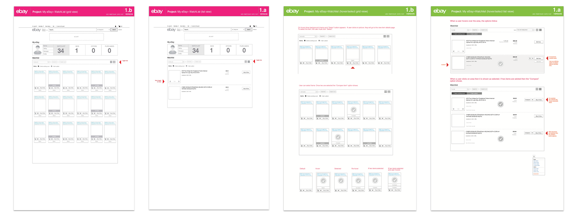

Mobile sub level examples

Outcomes and learnings
The overall re-design was a success and evangelized through the various teams for a future direction that would align with other initiatives. Usability testing went well and was more more intuitive cleaned up UI.
I believe my skills increased at navigating the big company processes and talking to the right people to get things moving forward. This definitely is a big challenge when various projects are in flight. Negotiations and compromising were key to making this project successful.