
Project: Enterprise health care mobile challenges for wearables.
Users would compete in challenges with co-workers to achieve prizes which would result in a healthier workforce saving companies money.
My role
Lead product design on challenge templates. This role was full hands on and worked directly with Marketing team initiatives that matched strategy with clients. I created all UI/Visuals and prototypes.
Lead product design on challenge templates. This role was full hands on and worked directly with Marketing team initiatives that matched strategy with clients. I created all UI/Visuals and prototypes.
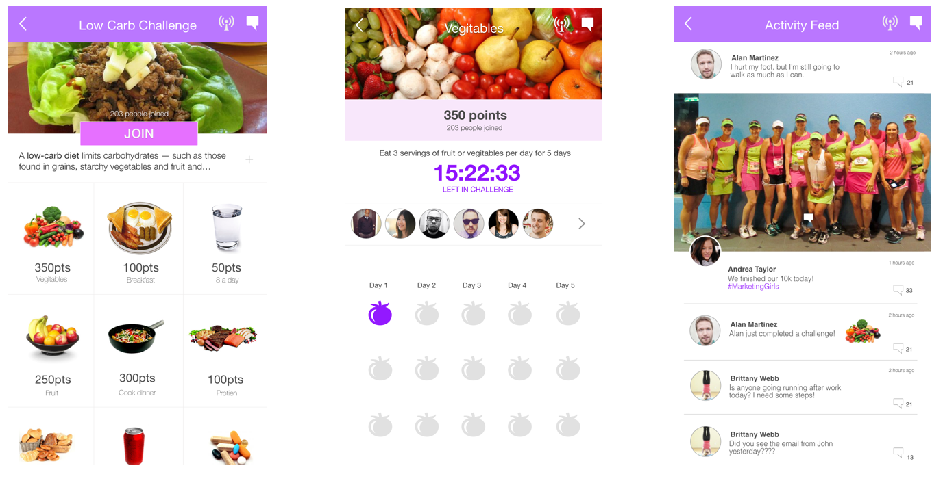
These are example screens from challenges created for clients who incentivize employees to become healthier. In the end, the employees receive rewards and health care costs drop.
Challenges
The visual/interaction style was intended to be simple, clean and easy to develop. Challenges were to overcome past design thinking which held down development due to the complexity of visuals and complex interaction. How do you make a UI that is fun and engaging based on making good habits, calories counted or steps from a wearable? How do you create an experience that is based off the technology constraints of the current wearable products.
Constraints
Wearable trackers were tracking Calories, Steps, Heart rate and distance at the time. Creativity was important to keep clients happy with new challenges but using the limited data that they provide.
Solutions
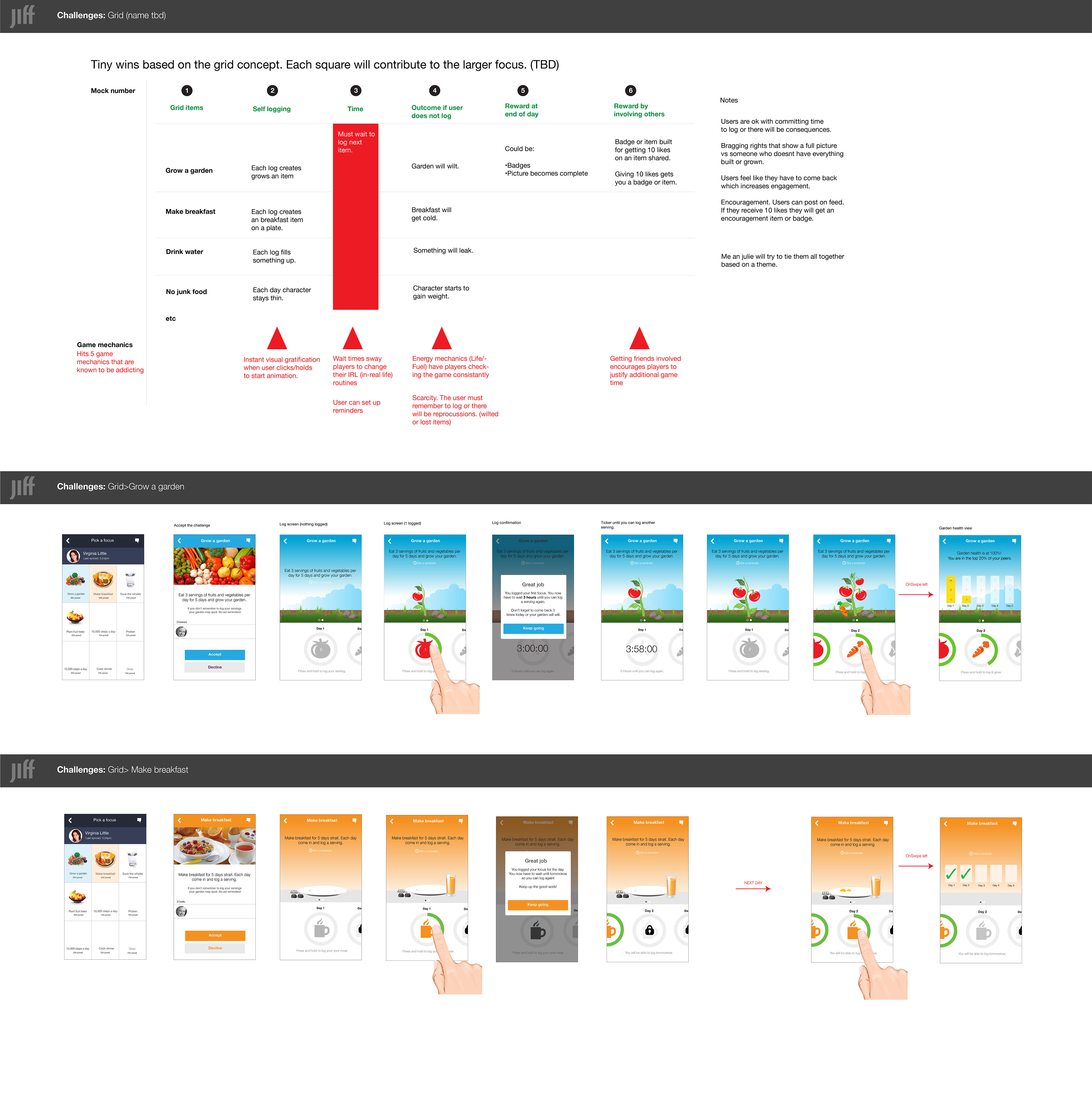
💡The solutions needed to be highly creative with the limited data. Together we came up with games that would be quick like "knockout" and other games that took a month or so to finish. Experiences based on steps that would intrigue the user and make them feel they are feeling a variety of challenges. Badges, rewards, leveling and other game mechanics I introduced to keep people delighted.
The visual/interaction style was intended to be simple, clean and easy to develop. Challenges were to overcome past design thinking which held down development due to the complexity of visuals and complex interaction. How do you make a UI that is fun and engaging based on making good habits, calories counted or steps from a wearable? How do you create an experience that is based off the technology constraints of the current wearable products.
Constraints
Wearable trackers were tracking Calories, Steps, Heart rate and distance at the time. Creativity was important to keep clients happy with new challenges but using the limited data that they provide.
Solutions
💡The solutions needed to be highly creative with the limited data. Together we came up with games that would be quick like "knockout" and other games that took a month or so to finish. Experiences based on steps that would intrigue the user and make them feel they are feeling a variety of challenges. Badges, rewards, leveling and other game mechanics I introduced to keep people delighted.
Design direction
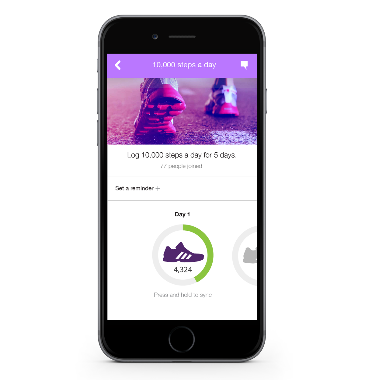
The direction of the screens you see above were designed with the thought that the page should feel "inviting" highly visual and easy to log your progression.
How do you give people the ability to log progression without cheating and just selecting all the options? I thought of creating a timed window where people had to log within that day or they would lose the ability to log. This kept people on point to keep challenging friends.
I wanted co-workers to feel engaged, so I added an activity feed that let users chat and also get alerts from other members when they were logging info which would create motivation.
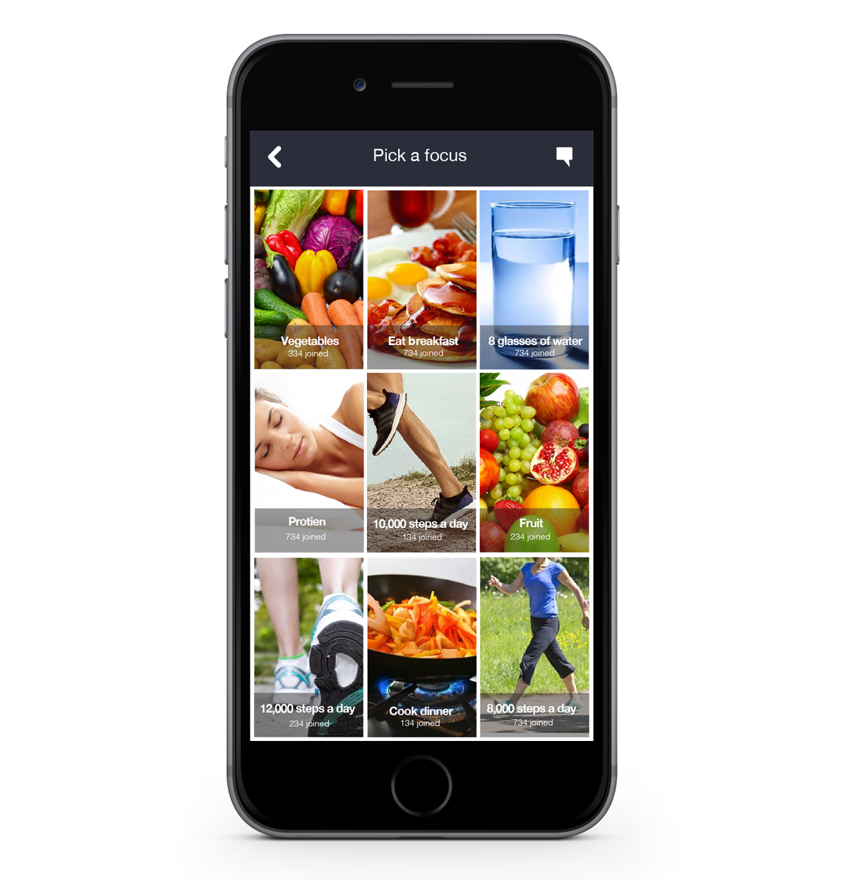
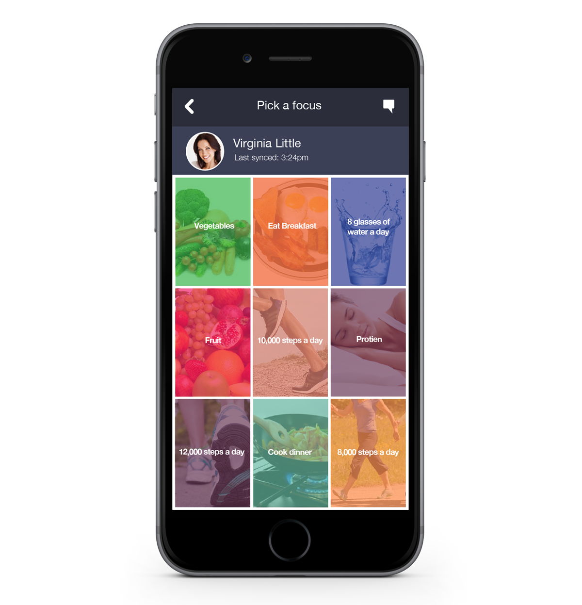
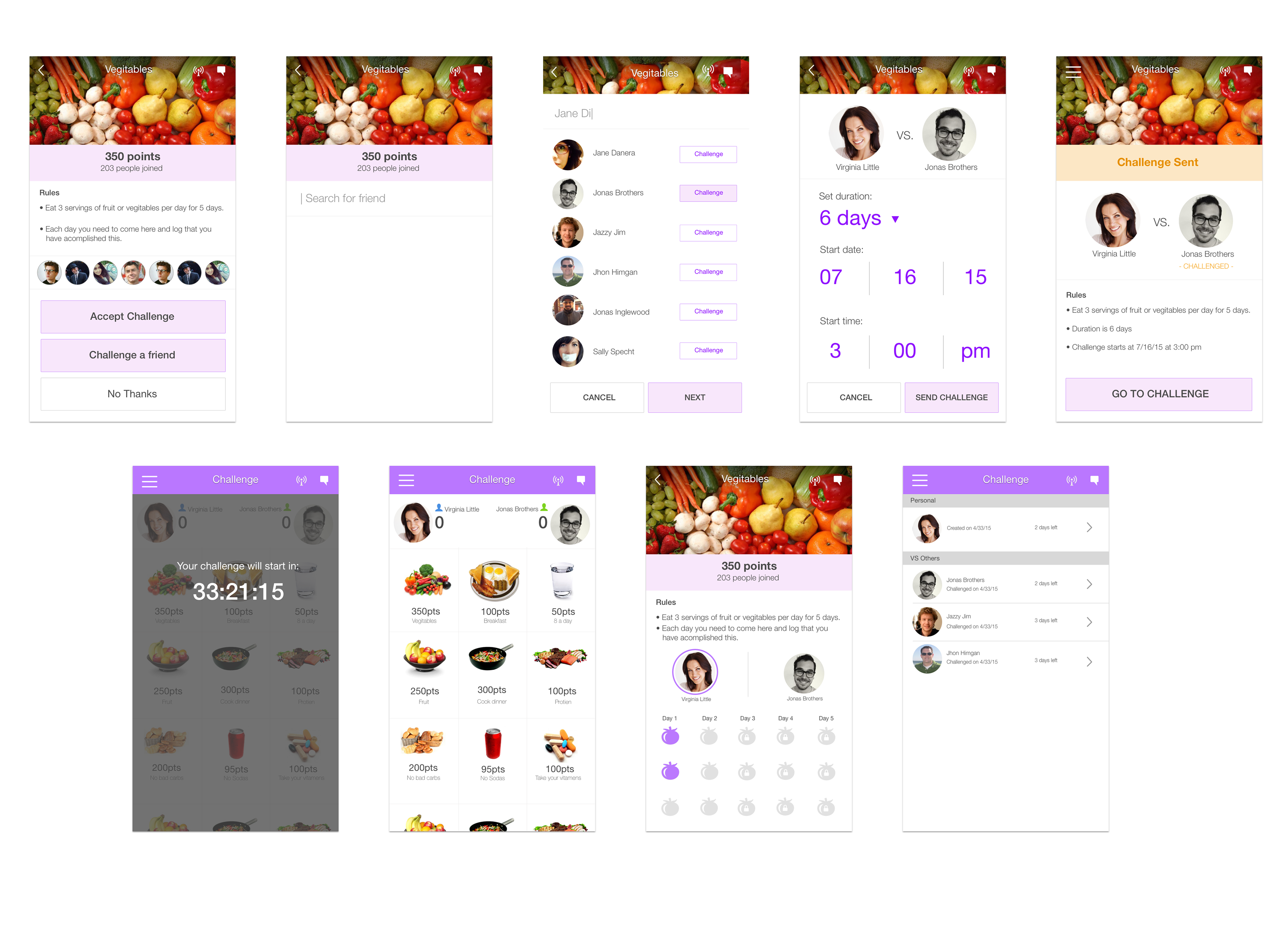
Above are the various challenges that I created. I worked with others to conceptualize games that would make steps and the use of your wearable interesting. It was quite a challenge to wrap a game like experience around the constraints of the data that a wearable would provide.
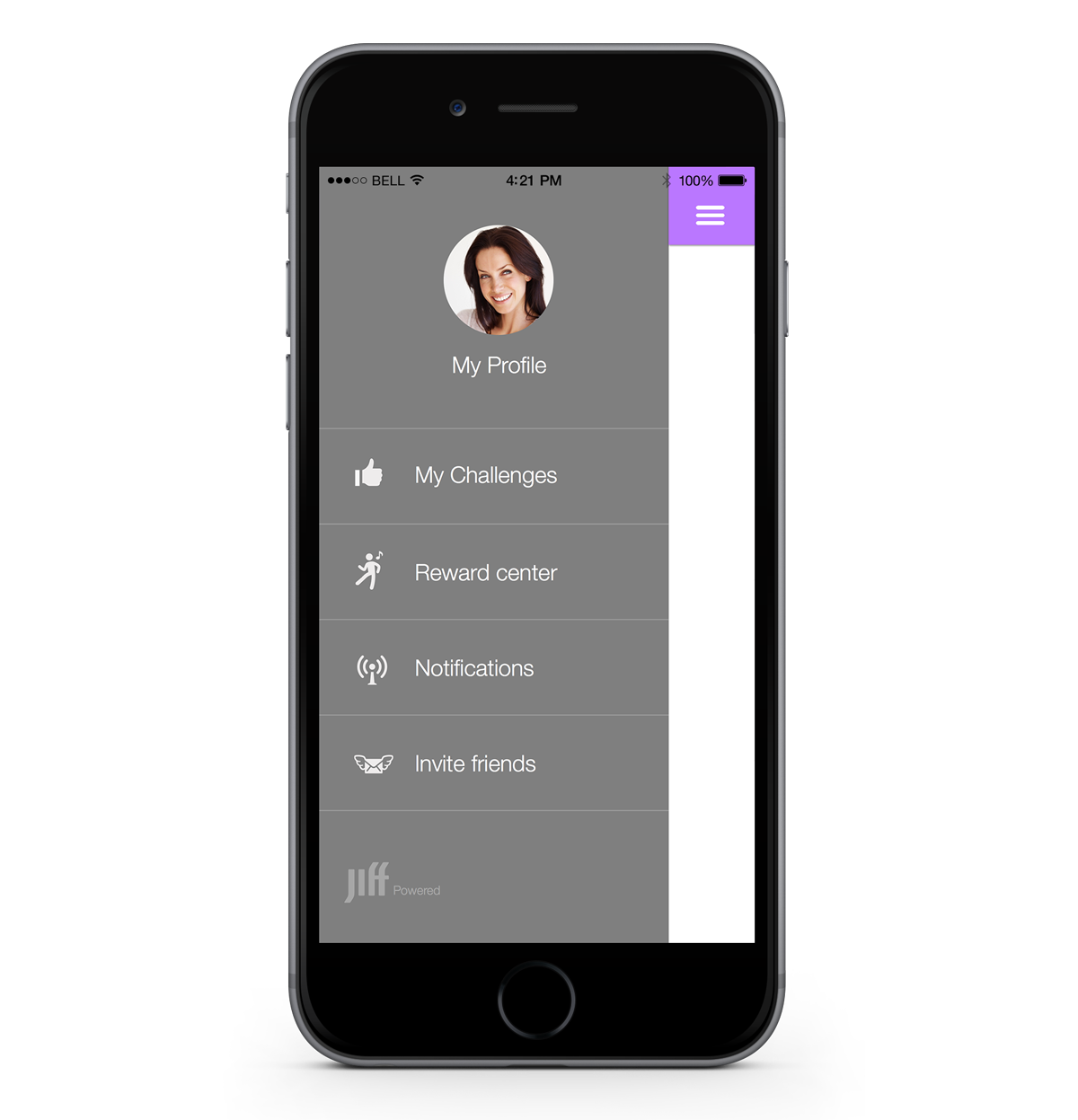
Easy access to a users challenges and reward center. Large touch points.
Status of how many parts of the challenge were completed and number of points achieved displayed prominently.
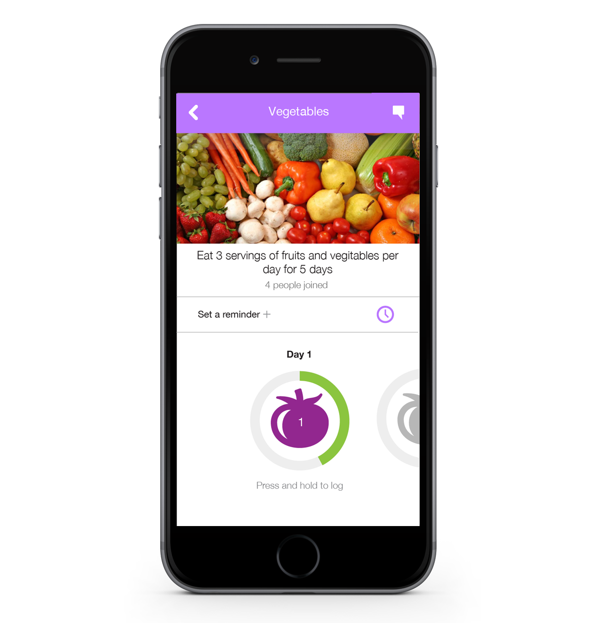
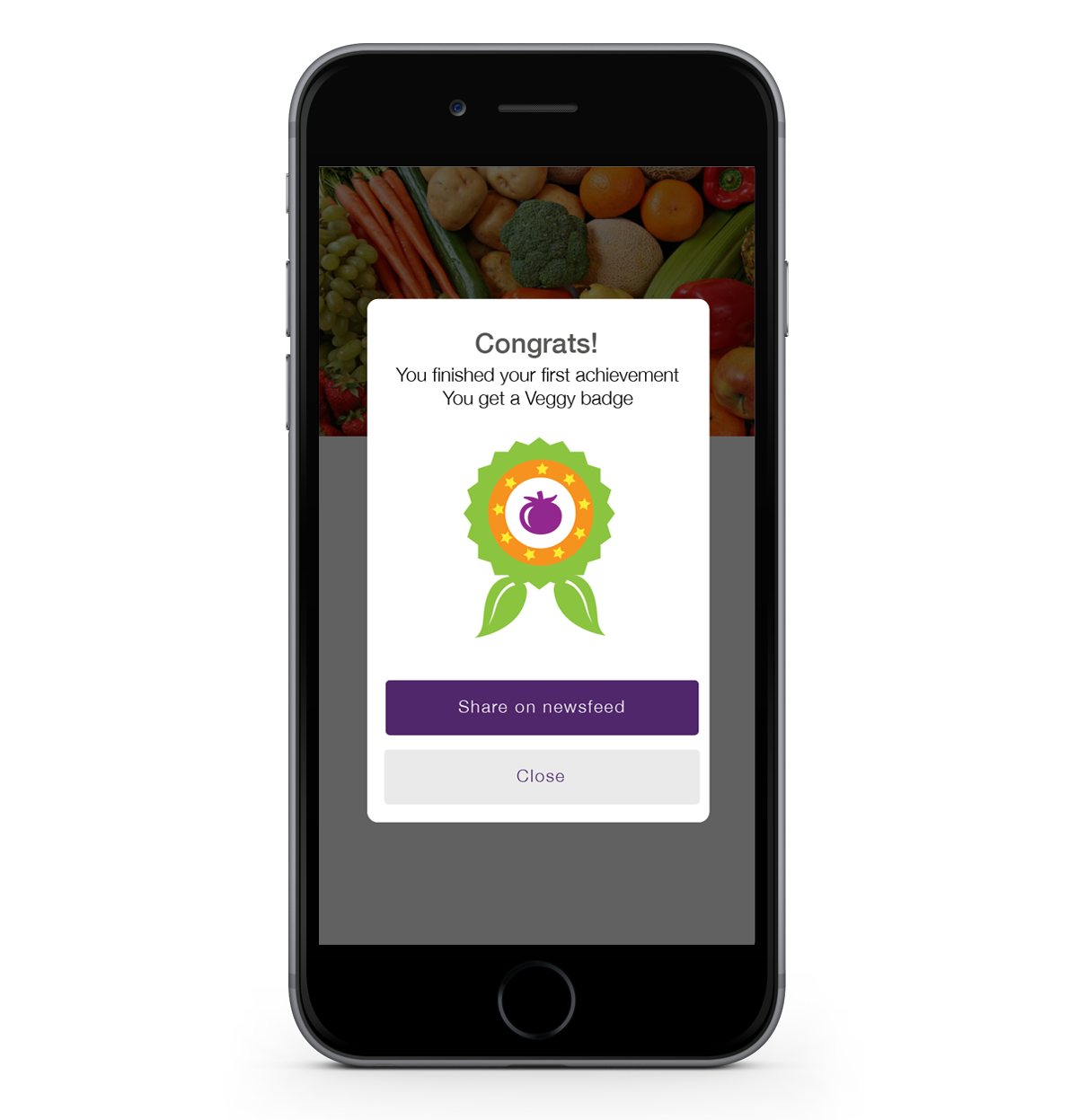
Click and hold to log a serving. Micro-interaction to delight the user instead of a simple click. The circle animated until full to log.
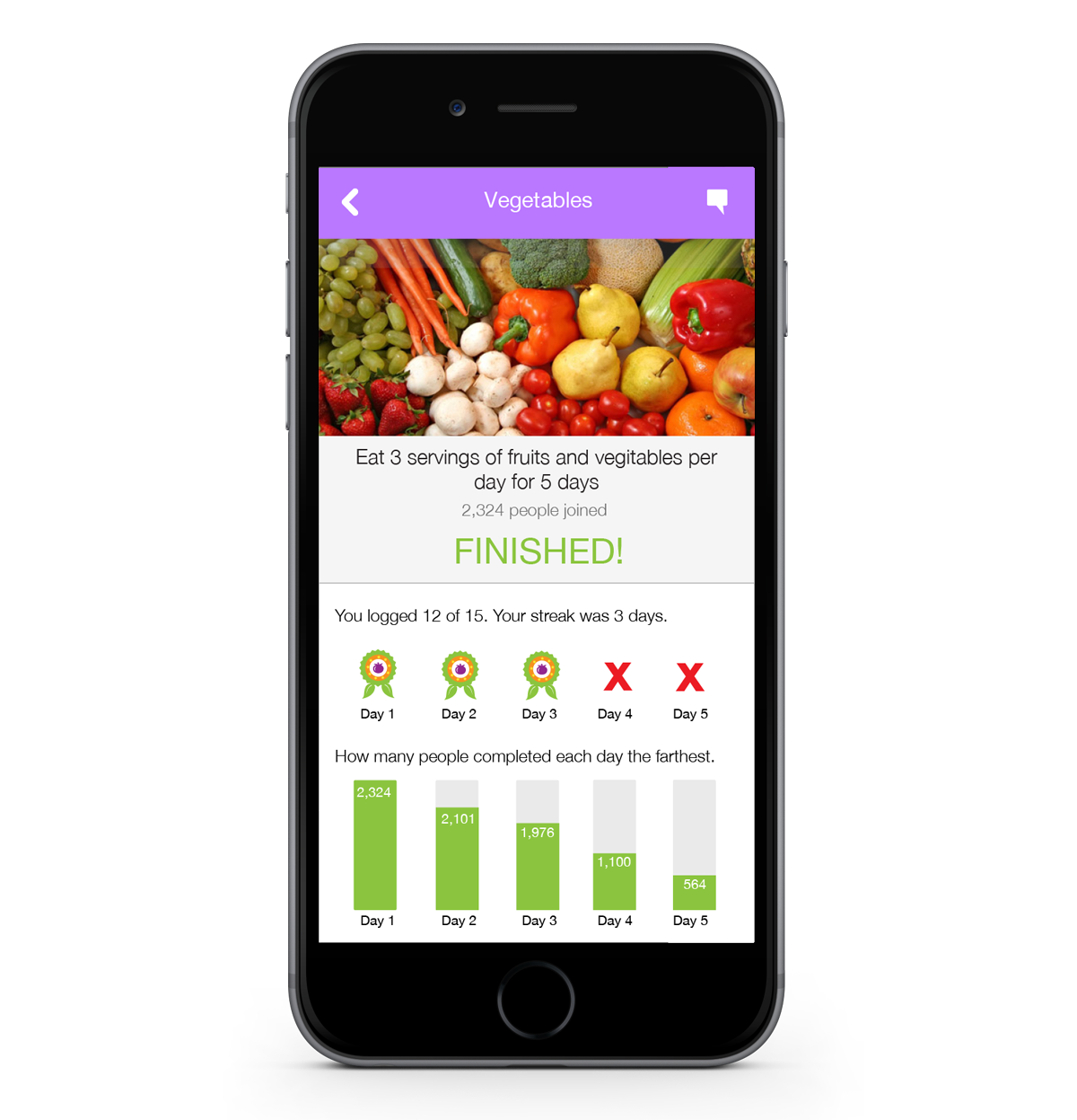
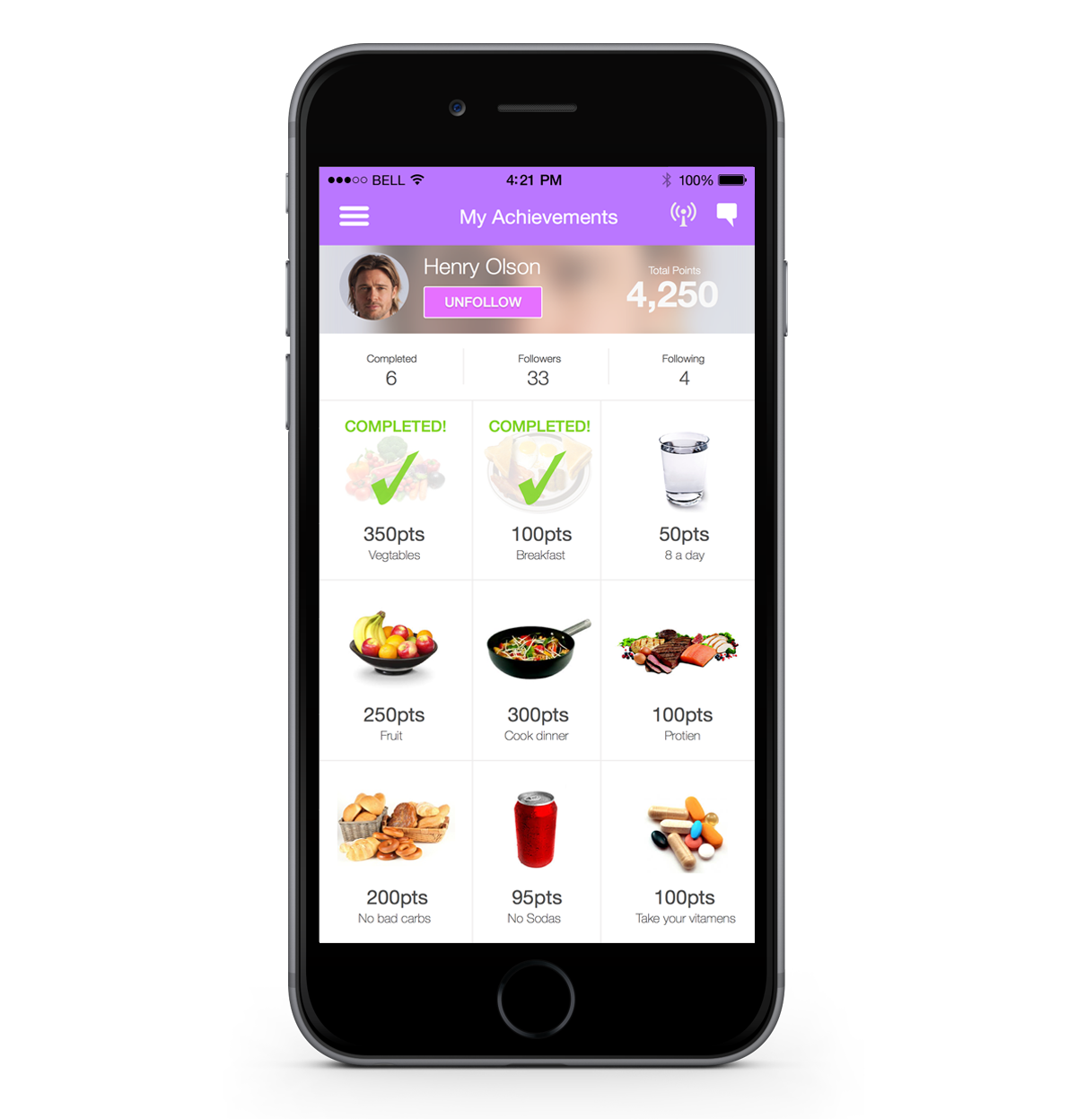
Clear status on where the user stands in the challenge. Information displayed of how others ranked also. The thought was to have a simple glance and know where you stood with the challenge.
Other visual styles for main view. This grid incorporates food and tracker capabilities.
Challenge a friend
Customers included:

Success measured
I believe overall not only as a startup but from the experiences we created for our clients were well received to the point of growth. We shipped multiple challenges a year to each customer and eventually the company was acquired for the direction this idea was going. I learned that speed to market, and a flat style would be easily developed UI helped provide faster deliverables to our clients.