
The Project
Take the newly released eBay profiles product and enhance where needed based on user feedback. Many of the eBay users were not open to change, so the challenge was to design an experience that would not disrupt much of their current interactions but yet innovate moving forward.
Take the newly released eBay profiles product and enhance where needed based on user feedback. Many of the eBay users were not open to change, so the challenge was to design an experience that would not disrupt much of their current interactions but yet innovate moving forward.
My design rational
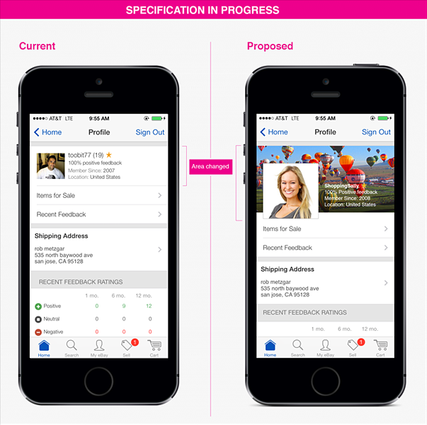
Learn from the last 7 months of user feedback and A/B testing cases and fix the interaction both visually and technically where it made sense as fast as possible. Areas in question were the confusion around editing, navigating the public and private view of a users profile.
Learn from the last 7 months of user feedback and A/B testing cases and fix the interaction both visually and technically where it made sense as fast as possible. Areas in question were the confusion around editing, navigating the public and private view of a users profile.
Solutions
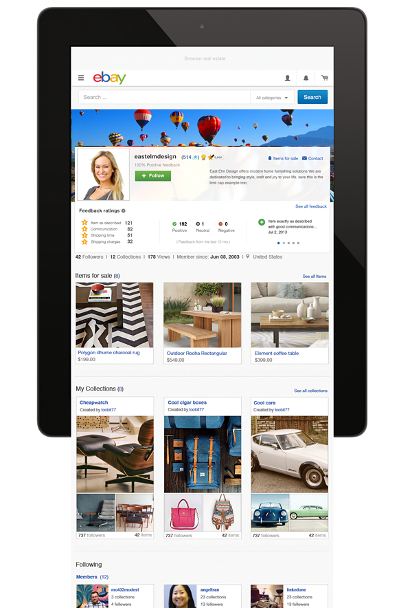
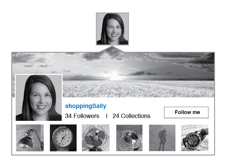
On-hover cues, better labeling, simple iconography and consistency of other patterns throughout the eBay service were the focus. I created a more friendly profile that gave the user the ability to customize the look and feel and promote the products they may be selling. I felt that overall expression was key for the user that cared about how they brand themselves. Easy editing similar to Facebook profiles and the ability to add collections with a few clicks were implemented. The thought was the easier and more intriguing we make the profile, users were more likely to fill out all the sections and build their network up by following others.
On-hover cues, better labeling, simple iconography and consistency of other patterns throughout the eBay service were the focus. I created a more friendly profile that gave the user the ability to customize the look and feel and promote the products they may be selling. I felt that overall expression was key for the user that cared about how they brand themselves. Easy editing similar to Facebook profiles and the ability to add collections with a few clicks were implemented. The thought was the easier and more intriguing we make the profile, users were more likely to fill out all the sections and build their network up by following others.
Early sample micro interactions were created to enhance small problem areas.
Responsive layout and design was created
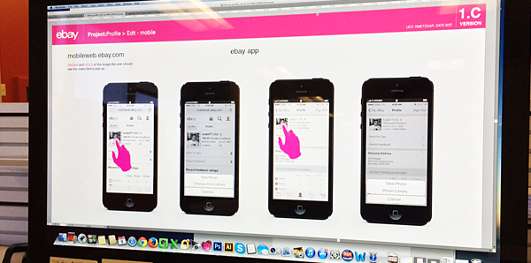
Tablet solutions needed to be matched with desktop
320px
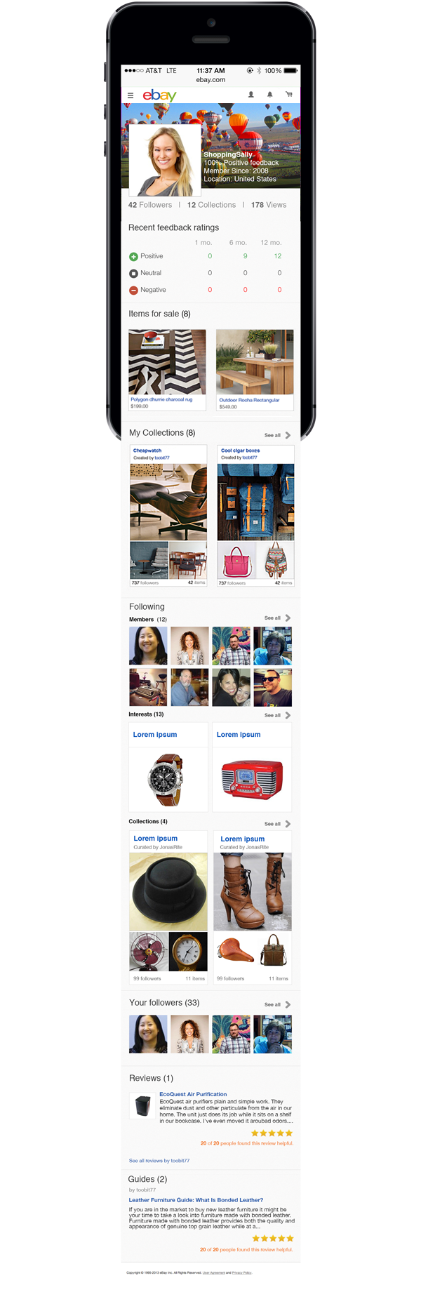
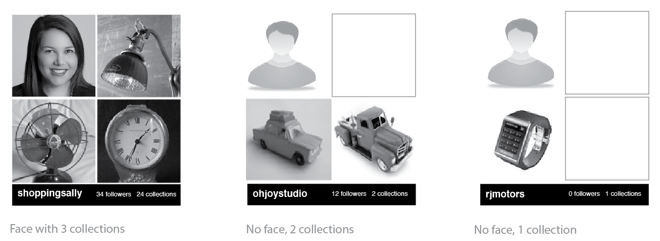
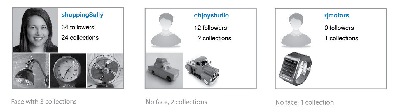
The area in the profile that was to be re-designed first was the "following" section. With a users lack of items for sale, or collections, the profile page was very minimal and the lists were very poorly designed and not intriguing.
Enhancing this area with bolder images, better profile contact cards and highlighting interest would engage the user if their current profile was lacking data.
Various concepts for contact cards in the following section
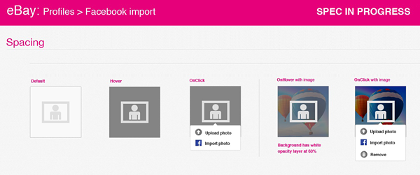
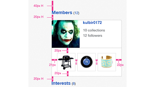
Detailed specifications for all modules were made
This project will continue to evolve in 2014-2015.